

Input controls are the interactive components in your app’s user interface. Android provides a wide variety of controls you can use in your UI, such as buttons, text fields, seek bars, check box, Edit Text, toggle buttons, and many more.
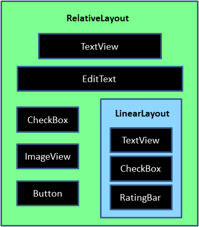
Every Android’s user interface is composed of a hierarchical collection of View and ViewGroup objects.
The View class is the base class of all graphical UI objects collectively called UI controls or Widgets like Button, TextView and many more, that you see on your Android device’s screen. Every visible UI control occupies an area on your screen and provides the point of interaction between you and the app through events like clicking, touching, and keying.
The ViewGroup class, on the other hand, is the invisible organizer that provides a variety of UI layouts to position the various View objects on your screen. For example, you may arrange the UI controls one above another in a linear fashion using LinearLayout layout, or relative to each other using RelativeLayout layout.
Android UI Controls
There are number of UI controls provided by Android that allow you to build the graphical user interface for your app.
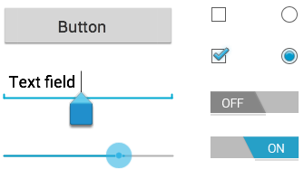
1 TextView: This control is used to display text to the user.
2 EditText: EditText is a predefined subclass of TextView that includes rich editing capabilities.
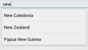
3 AutoCompleteTextView: The AutoCompleteTextView is a view that is similar to EditText, except that it shows a list of completion suggestions automatically while the user is typing.
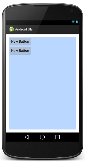
4 Button: A push-button that can be pressed, or clicked, by the user to perform an action.
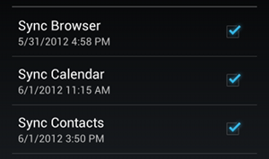
5 CheckBox: An on/off switch that can be toggled by the user. You should use check box when presenting users with a group of selectable options that are not mutually exclusive.
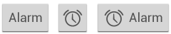
6 ToggleButton: An on/off button with a light indicator.

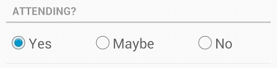
7 RadioButton: The RadioButton has two states: either checked or unchecked.
RadioGroup is used to group together one or more RadioButtons.
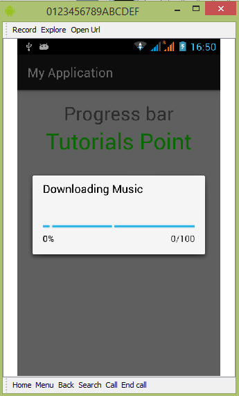
8 ProgressBar: The ProgressBar view provides visual feedback about some ongoing tasks, such as when you are performing a task in the background.
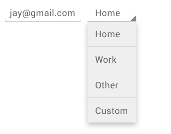
9 Spinner: A drop-down list that allows users to select one value from a set.
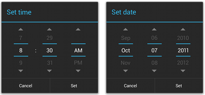
10 Picker: TimePicker enables users to select a time of the day, in either 24-hour mode or AM/PM mode.
DatePicker enables users to select a date of the day.
Creating UI Controls
To create a UI Control/View/Widget you will have to define a view/widget in the layout file and assign it a unique ID as follows
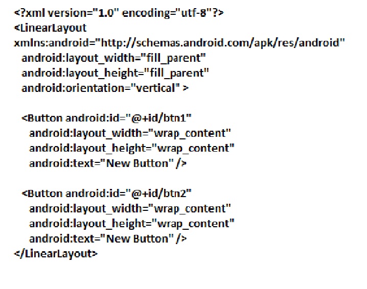
Then finally create an instance of the Control object and capture it from the layout to your main Activity, As follows −
public class MainActivity extends Activity {

   Button b1,b2;

   @Override

   protected void onCreate(Bundle savedInstanceState) {

      super.onCreate(savedInstanceState);

      setContentView(R.layout.activity_main);

      b1=(Button)findViewById(R.id.btn1);

      b2=(Button)findViewById(R.id.btn2);

      b1.setOnClickListener(new View.OnClickListener() {

         @Override

         public void onClick(View v) {
}
});
b2.setOnClickListener(new View.OnClickListener() {
@Override
public void onClick(View v) {
}
});
}
}
Their is a app called UI CONTROL Link:https://play.google.com/store/apps/details?id=tst.example.uicontrols&hl=en you can download it to know more about UI controls
 PracticalCoding.in